Tabs, Pads and Boards
In the post-PC era, we are getting closer to the vision of ubiquitous computing, a termed coined by Mark Weiser in 1988 (a chief scientist at Xerox PARC in the U.S.). Simply put, computing would be on any device, in any location, and in any format.
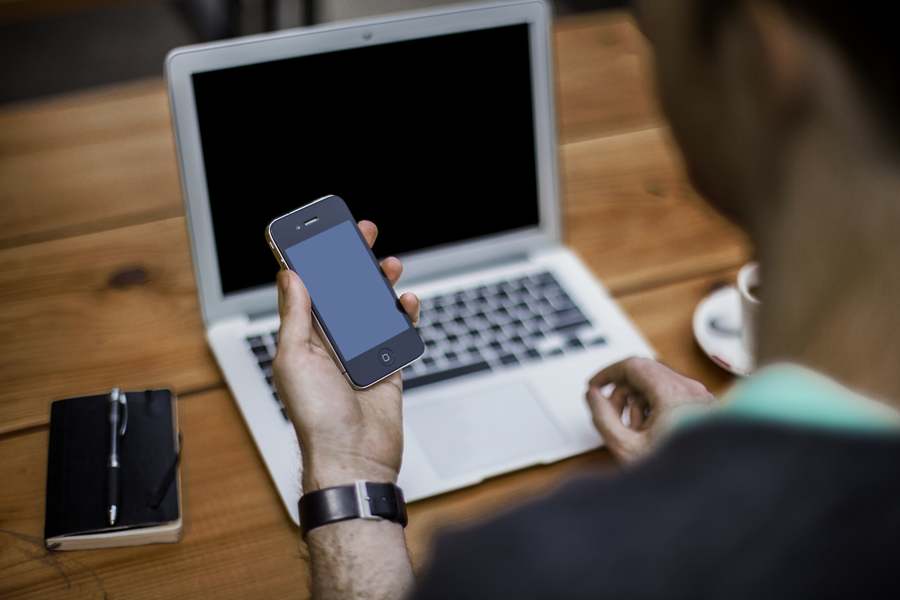
We're getting there. During my son's homework this week we created a Word document on an iPad, inserted a photo taken on a Windows phone, saved the doc to the cloud via Dropbox, printed the doc from a laptop over wifi to a printer.
Weiser helpfully proposed three basic forms for ubiquitous system devices;
Tabs: wearable centimetre sized devices
Pads: hand-held decimetre-sized devices
Boards: metre sized interactive display devices
(Thank you to Andrew Parker of Spark Capital for reminding me of this in his excellent post; "Ubiquitous Computing and iPad Doomsayers. He in turn was inspired to write thanks to data shared by Benedict Evans of Andreessen Horowitz showing that iPad sales have flatlined.)
I find the Tab/Pad/Board definition very relevant.
Tabs: phones, watches and wearable tech
Pads: tablets and laptops
Boards: TVs
Where does the PC fit? In terms of usability, it's more of a Tab than a Board. I personally use a laptop (Tab) and when I'm at my desk I attach a second monitor (Board).
Increasingly tasks that were once done on a PC screen are being done on a mobile screen. In yesterday's Twitter earnings report, they reported 78% of their users accessing via mobile. Last time I looked there was a 62% smartphone penetration in the UK.
5 years ago, applications delivered over the web were optimised for desktop PC. That obviously no longer the case. "Mobile first" is increasingly common.
However, when deciding what screen size to optimise for, there are several dimensions to consider
1. When and where will the application be used?
On the train/bus, in the living room, in the car, at the office, at a desk, in a meeting? Tabs are ideal for "on the move", Boards for sitting down in one place. Pads can be both.
2. Is the application for consumption or creation?
Tasks that are creative often require a keyboard and more space to work. Desktop tools still dominate for creative activity.
3. If for consumption, is it a shared experience?
TV trumps mobile for a shared viewing experience.
4. What is the session duration likely to be?
Quick, short tasks are more likely to be done mobile.
5. Is the application for business or consumer?
Many businesses supply their staff with one device, often a PC (desktop/laptop). If you are building B2B software, the majority of your users will still access your product on a larger screen.
6. What does the data say?
Ultimately you need to understand the behavourial patterns of your users and make a call as to how that might change over the coming couple of years. On the former, you can study and measure this, on the latter, it's an informed guess.
Finally a word about mobile ecommerce
When it comes to ecommerce, especially consumer ecommerce, it's becoming clear that mobile matters. Comsumers will purchase goods on the move from a smartphone if it is easy enough for them to do.
Easy? How?
Google has just published an excellent whitepaper, Principles of Mobile Site Design: Delight Users and Drive Conversions which is well worth a read.